Dyalog ’18 Videos, Week 2

Each week until early January, we will be releasing a selection of recordings of presentations from Dyalog’18, which was held in Belfast at the end of October 2018. Last week we kicked off with the opening keynote talks and the prize ceremony and acceptance speech by the winner of our annual problem-solving competition.

Just under half of the presentations at Dyalog User Meetings are by users who have volunteered – or sometimes been commandeered – to share stories about how they have used APL for fun or profit. These user stories provide significant motivation to the Dyalog team for future direction.

Aaron Hsu’s talk on “High Performance Tree Wrangling, the APL Way” is a pearl. Back in 2015 I gave a talk at Google on APL. One of the Google engineers asked about working with trees in APL and I was unable to give him a useful answer. Aaron is working on a compiler for APL, and trees that represent the code that is being compiled are his most important type of data structure.
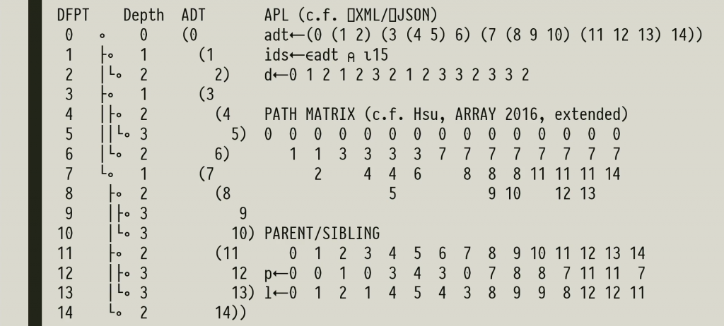
In this talk Aaron demonstrates that APL is an elegant – and highly efficient – notation for working with trees, if you just pick the right representation!


Most of the talks at Dyalog User Meetings are fairly technical. The subject at the core of Ilaria Piccirilli’s talk – the fair pricing of financial instruments and subsequent evaluation of portfolios – is no exception. Mercifully, Ilaria spares us the details of the calculations – as she dryly notes, there is no “Fair Pricing for Dummies”. Instead, she offers humorous insights into the way her team used APL to deal with the explosion of computations required by regular additions to legislation requiring health checks – and the day that negative interest pulled the rug out from under most standard pricing calculations.

The other, slightly larger half of the talks at Dyalog Users meetings are by members of the Dyalog Team, talking about work that has recently been done on our products or presenting designs for future enhancements.


Adám Brudzewsky’s talk, titled Array Notation Mk III, is about a potential future extension to the APL language, which will make it possible to easily and clearly describe arrays of high rank, or with deeply nested structure, without using APL primitives to “construct” them, as is common practice today. In addition to making application code easier to read and write, a literal notation for data structures will make it easy to use text files to describe data structures which are essentially part of the source code of an application, and should be managed by a source code management system. As the name suggests, this work has been ongoing for some time, with the initial inspiration coming from a user presentation by Phil Last, back at Dyalog ’15 in Sicily. Watch the presentation and give us feedback on whether you think this idea is now sufficiently baked to become part of Dyalog APL, or we’ll need a “Mk IV” talk next year!


With the growth in usage of Dyalog APL under macOS and Linux – especially in server or cloud environments – the Dyalog Remote Integrated Development Environment is becoming a “mainstream” tool, rather than the curiosity that it was during the first few years of development. Our partners at Optima Systems are developing RIDE on Dyalog’s behalf, and Gilgamesh Athoraya is now the lead developer. In his talk on “RIDE 4.1 and Next Generation Integrations”, Gil talks first about significant new features and performance improvements to RIDE in 4.1 – and then continues to talk about how components of the RIDE technology may be re-purposed to provide APL add-ins for popular development frameworks like the new Microsoft VS Code.

Summary of this week’s videos:

Welcome to the Dyalog ’18 Videos!

Three weeks have gone by since we waved goodbye to the last Dyalog ’18 delegates in Belfast. We’ve had time to catch up on sleep, half of us have had colds and recovered from them. Jason Rivers and Richard Park have started mixing and improving the audio and video recordings, and we are ready to release the first group of processed videos.


Our plan is to release batches of 3-5 videos, with enough variety for everyone to find at least one topic of interest each week. We have not reviewed all of the material yet; there are always one or two where something went wrong and we are unable to publish the recordings (or the presenter asks that we refrain from making the talk public), but we do expect to be able to make the vast majority of the talks available over the next couple of months.

Each week, I’ll be doing my best to introduce each set with a blog entry: The first batch contains cleaned-up versions of the presentations that were streamed live from Belfast. The audio and video quality is significantly enhanced compared to the live stream, and the most confusing gaffes in my own live demo have been removed 😊.


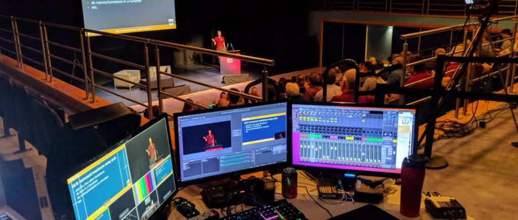
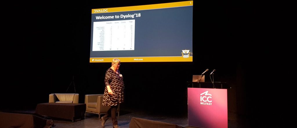
As usual, the user meeting opened with the traditional trio of keynotes by Dyalog’s CEO Gitte Christensen, the CXO Morten Kromberg (that’s me) and CTO Jay Foad. Gitte introduces a couple of new faces at Dyalog, and the contest winners, so everyone can plan to buy the winners drinks during the week. Gitte then discusses high level direction – announcing our intention to make the Linux version available to download, and included in public Docker containers and Cloud VM images, with no questions asked.


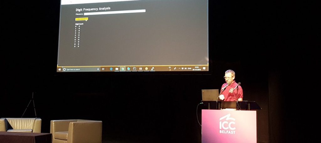
My own session mostly consists of a live demo of the potential consequences of making Linux licences really easy to get hold of. In an imaginary conversation with a data scientist, I demonstrate the use of Dyalog APL to implement an (admittedly silly) analytical function, and subsequently make it available as a web service and via a web site, finally deplying it to the cloud using a set of Public Docker containers, without once installing Dyalog APL itself.


Jay Foad rounded Monday’s live stream off with a review of the features of the recently released version 17.0, before moving on to talk about the work that the development team is planning for versions 17.1 and 18.0, scheduled for the spring of 2019 and 2020, respectively.


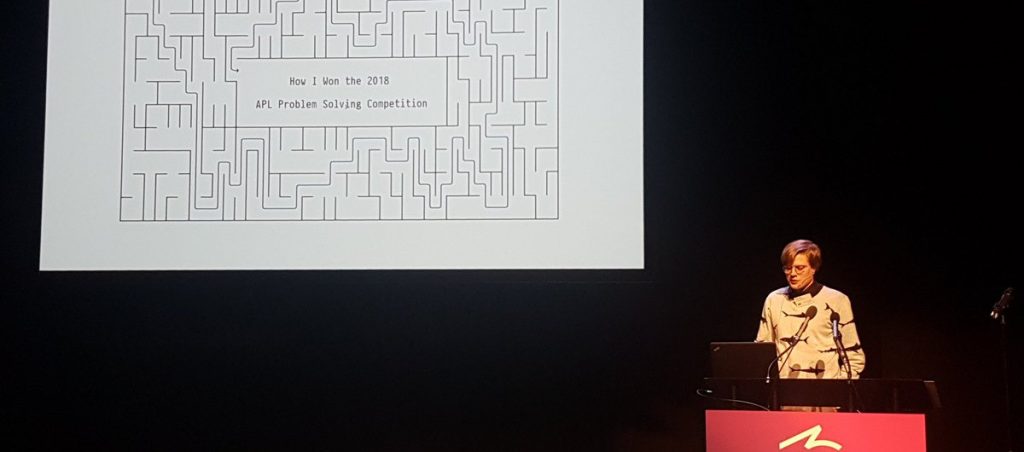
In accordance with tradition, we also streamed the Prize Ceremony for the International Problem-Solving Competition and – often the most interesting talk of the year – the acceptance speech where this year’s winner talked about his code, and the experience of learning APL. This year’s winner did not let us down; it is amazing how quickly you can learn to write really, really good APL code!

Summary of this week’s videos:

Beauty and the Beast

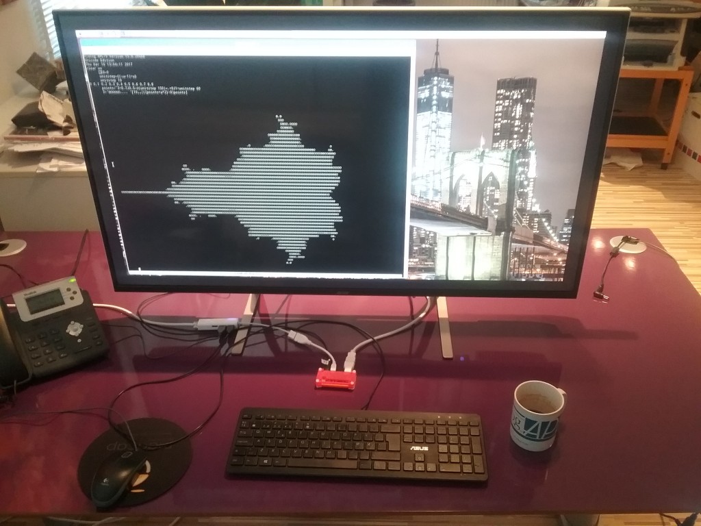
beauty-and-the-beastFinally, the last accessory I ordered for my Raspberry Pi Zero (that’s the little red thing behind my keyboard) has arrived – an Acer 43″ ET430K monitor. The Zero won’t quite drive this monitor at its maximum resolution of 3840×2160 pixels, but as you can see, you get enough real estate to do real graphics with “ASCII Art” (well, Unicode Art, anyway)!

Some readers will recognise the image as the famous Mandelbrot Set, named after the mathematician Benoit Mandelbrot, who studied fractals. According to Wikipedia a fractal is a mathematical set that exhibits a repeating pattern displayed at every scale – they are interesting because they produce patterns that are very similar to things we can see around us – both in living organisms and landscapes – they seem to be part of the fundamental fabric of the universe.

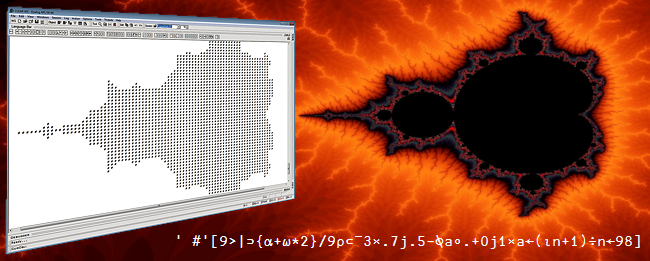
Fractals are are also interesting because they produce images of staggering beauty, as you can see on the pages linked to above and one of our rotating banner pages, where a one-line form of the APL expression which produced the image is embedded:

Website_banner_MbrotW

The colourful images of the Mandelbrot set are produced by looking at a selection of points in the complex plane. For each point c, start with a value of 0 for z, repeat the computation z = c + z², and colour the point according to the number of iterations required before the function becomes “unbounded in value”.

In APL, the function for each iteration can be expressed as {c+⍵*2}, where c is the point and ⍵ (the right argument of the function) is z (initially 0, and subsequently the result of the previous iteration):

      f←{c+⍵*2} ⍝ define the function
      c←1J1     ⍝ c is 1+i (above and to the right of the set)
      (f 0)(f f 0)(f f f 0)(f f f f 0) (f f f f f 0)
1J1 1J3 ¯7J7 1J¯97 ¯9407J¯193

If you are not familiar with complex numbers, those results may look a bit odd. While complex addition just requires adding the real and the imaginary parts independently, the result of multiplication of two complex numbers (a + bi) and (c + di) is defined as (ac-db) + (bc+ad)i. Geometrically, complex multiplication is a combined stretching and rotation operation.

Typing all those f’s gets a bit tedious, fortunately APL has a power operator , a second-order function that can be used to repeatedly apply a function. We can also compute the magnitude of the result number using |:

      (|(f⍣6)0)(|(f⍣7)0)
8.853E7 7.837E15

Let’s take a look at what happens if we choose a point inside the Mandelbrot set:

      c←0.1J0.1
      {|(f⍣⍵)0}¨ 1 2 3 4 5 6 7 8 9 10
0.1414 0.1562 0.1566 0.1552 0.1547 0.1546 0.1546 0.1546 0.1546 0.1546

Above, I used an anonymous function so I could pass the number of iterations in as a parameter, and use the each operator ¨ to generate all the results up to ten iterations. In this case, we can see that the magnitude of the result stabilises, which is why the point 0.1 + 0.1i is considered to be inside the Mandelbrot set.

Points which are just outside the set will require varying numbers of applications of f before the magnitude “explodes”, and if you colour points according to how many iterations are needed and pick interesting areas along the edge of the set, great beauty is revealed.

1200px-GalaxyOfGalaxies

The above image is in the public domain and was created by Jonathan J. Dickau using ChaosPro 3.3 software, which was created by Martin Pfingstl.

Our next task is to create array of points in the complex plane. A helper function unitstep generates values between zero and 1 with a desired number of steps, so I can vary the resolution and size of the image. Using it, I can create two ranges, multiply one of them by i (0J1 in APL) and use an addition table (∘.+) to generate the array:

      ⎕io←0 ⍝ use index origin zero
      unitstep←{(⍳⍵+1)÷⍵}
      unitstep 6
0 0.1667 0.3333 0.5 0.6667 0.8333 1
      c←¯3 × 0.7J0.5 - (0J1×unitstep 6)∘.+unitstep 6
      c
¯2.1J¯1.5 ¯1.6J¯1.5 ¯1.1J¯1.5 ¯0.6J¯1.5 ¯0.1J¯1.5 0.4J¯1.5 0.9J¯1.5
¯2.1J¯1   ¯1.6J¯1   ¯1.1J¯1   ¯0.6J¯1   ¯0.1J¯1   0.4J¯1   0.9J¯1  
¯2.1J¯0.5 ¯1.6J¯0.5 ¯1.1J¯0.5 ¯0.6J¯0.5 ¯0.1J¯0.5 0.4J¯0.5 0.9J¯0.5
¯2.1      ¯1.6      ¯1.1      ¯0.6      ¯0.1      0.4      0.9     
¯2.1J00.5 ¯1.6J00.5 ¯1.1J00.5 ¯0.6J00.5 ¯0.1J00.5 0.4J00.5 0.9J00.5
¯2.1J01   ¯1.6J01   ¯1.1J01   ¯0.6J01   ¯0.1J01   0.4J01   0.9J01  
¯2.1J01.5 ¯1.6J01.5 ¯1.1J01.5 ¯0.6J01.5 ¯0.1J01.5 0.4J01.5 0.9J01.5

The result is subtracted from 0.7J0.5 (0.7 + 0.5i) to get the origin of the complex plane slightly off centre in the middle, and multiplied the whole thing by 3 to get a set of values that brackets the Mandelbrot set.

Note that APL expressions are typically rank and shape invariant, so our function f can be applied to the entire array without changes. Since our goal is only to produce ASCII art, we don’t need to count iterations, we can just compare the magnitude of the result with 9 to decide whether the point has escaped:

      9<|f 0
0 0 0 0 0 0 0
0 0 0 0 0 0 0
0 0 0 0 0 0 0
0 0 0 0 0 0 0
0 0 0 0 0 0 0
0 0 0 0 0 0 0
0 0 0 0 0 0 0
      9<|(f⍣3) 0 ⍝ Apply f 3 times
1 1 1 0 0 0 1
1 0 0 0 0 0 0
0 0 0 0 0 0 0
0 0 0 0 0 0 0
0 0 0 0 0 0 0
1 0 0 0 0 0 0
1 1 1 0 0 0 1

We can see that points around the edge start escaping after 3 iterations. Using an anonymous function again, we can observe more and more points escape, until we recognise the (very low resolution) outline of the Mandelbrot set:


      ]box on
      {((⍕⍵)@(⊂0 0))' #'[9>|(f⍣⍵)0]}¨2↓⍳9
┌───────┬───────┬───────┬───────┬───────┬───────┬───────┐
│2######│3  ### │4      │5      │6      │7      │8      │
│#######│ ######│   ### │    #  │    #  │    #  │    #  │
│#######│#######│ ##### │  #### │  #### │   ### │   ### │
│#######│#######│###### │ ##### │ ##### │ ##### │ ####  │
│#######│#######│ ##### │  #### │  #### │   ### │   ### │
│#######│ ######│   ### │    #  │    #  │    #  │    #  │
│#######│   ### │       │       │       │       │       │
└───────┴───────┴───────┴───────┴───────┴───────┴───────┘

The last example allowed me to sneak in a preview of the new “at” operator coming in Dyalog v16.0. It is a functional merge operator that I am using to insert the formatted right argument (the number of iterations) into position (0 0) of each matrix.

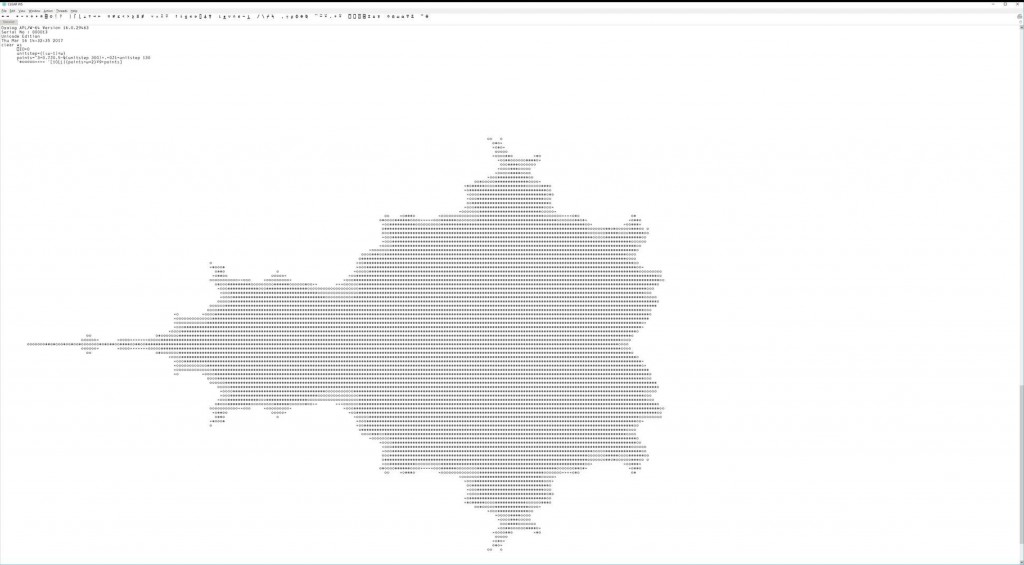
If I use our remote IDE (RIDE) on my Windows machine and connect to the Pi, I can have an APL session on the Pi with 3840×2160 resolution. In this example, I experimented with grey scale “colouring” the result by rounding down and capping the result at 10, and using the character ⍟ (darkest) for 0, ○ for 1-5, × for 6-9, and blank for points that “escaped”, by indexing into an array of ten characters:

      '⍟○○○○○×××× '[10⌊⌊|(f⍣9)c]

Who needs OpenGL?! (click on the image to enlarge)

mandelbrot-ride4

Charting Reaction Times on the Raspberry Pi

Earlier this week I collected some reaction timer data on my Pi using the BBC micro:bit as an input device. I only produced an “ASCII art” chart at the time:

      times←ReactionTimer.Play
      times
251 305 294 415 338 298 294 251 378
      ReactionTimer.AsciiChart times
425| 
400|    * 
375|         *
350+ 
325|     * 
300|  * 
275|   *  ** 
250+ *      * 

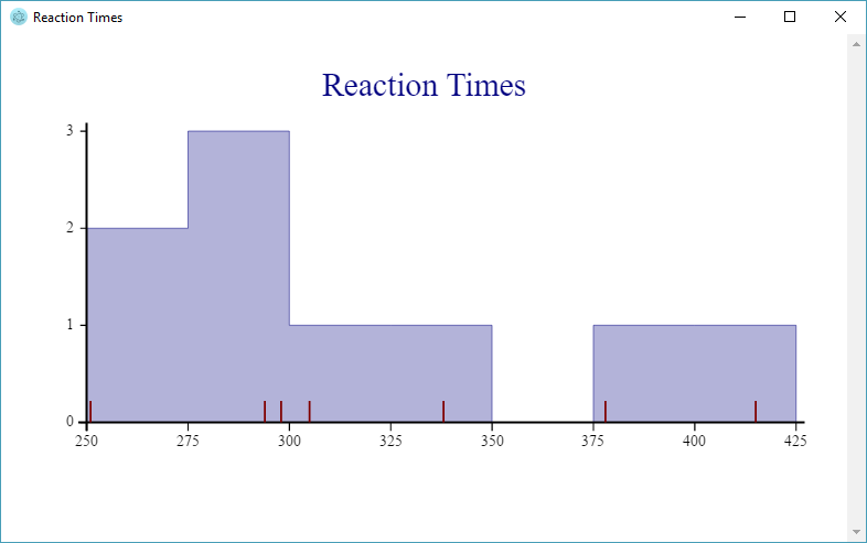
Retro is back in style – but of course I should point out that we can produce “proper” graphics using SharpPlot, a cross-platform graphics package that is included with Dyalog APL on all platforms. I’ve enhanced the ReactionTimer namespace with a function called SPHistogram. If you are using RIDE as the front end to APL on the Pi, this will render output from SharpPlot in a window:

    ReactionTimer.SPHistogram times

Reaction Time Histogram

The original ASCII chart simply plotted the observations in the order that they occurred. Above, the shaded areas show how many observations there were in each bucket (2 between 250ms and 275ms, 3 between 275ms and 300ms, and so on). At the same time, the individual observations can be seen along the X axis as vertical red lines. It is a little unfortunate that, presumably due to some artifact of the timing process, the values 251 and 294 occur twice – and these lines are drawn on top of each other.

The example highlights one of the things that makes SharpPlot a bit special: We have overlaid a histogram showing the frequency of reactions in each bucket, and used a “scatterplot” to where the Y value is always 0, to mark the individual observations along the X axis.

     ∇ SPHistogram times;heading;renderHtml;sp;svg;z 
[1]   heading←'Reaction Times' 
[2]   renderHtml←3500⌶ ⍝ Render HTML in Window 
[3] 
[4]   :If 0=⎕NC'#.SharpPlot' ⋄ #.⎕CY'sharpplot.dws' ⋄ :EndIf
[5] 
[6]   sp←⎕NEW #.SharpPlot(432 250) 
[7]   sp.Heading←heading 
[8] 
[9]   ⍝ Draw histogram 
[10]  sp.ClassInterval←25 
[11]  sp.SetXTickMarks 25 
[12]  sp.HistogramStyle←#.HistogramStyles.SurfaceShading 
[13]  sp.SetFillStyles #.FillStyle.Opacity30 
[14]  sp.DrawHistogram⊂times 
[15] 
[16]  ⍝ Add observations using ScatterPlot 
[17]  sp.SetMarkers #.Marker.UpTick 
[18]  sp.SetPenWidths 1 
[19]  sp.SetMarkerScales 3 
[20]  sp.DrawScatterPlot(times×0)(times) 
[21] 
[22]  ⍝ Render SVG and display in window 
[23]  svg←sp.RenderSvg #.SvgMode.FixedAspect 
[24]  z←heading renderHtml svg 
     ∇ 

Hopefully the code is more or less self-explanatory, but if you’d like to learn more about SharpPlot there is excellent documentation at http://sharpplot.com. The documentation is actually written for C# users, but there is an illustration of how to translate the documentation to APL (and VB) at http://www.sharpplot.com/Languages.htm.

micro:bit Reaction Timer in APL on the Pi and BBC micro:bit

BBC micro:bit displaying a happy face

BBC micro:bit displaying a happy face

I have a bit of a cold today, so I decided that instead of hopping in an icy car and driving to the office in order to spend the day drinking coffee and answering e-mail, I should stay at home, turn up the radiators, make lots of tea (with honey!) and have some fun writing code on my Raspberry Pi! Can there be a better way to ensure a speedy recovery?

By the way, if you are already a user of Dyalog APL but you haven’t got a Pi yet, you should read The APLer’s Quick-start Guide to the Raspberry Pi, which Romilly Cocking completed a few days ago. This explains what your options are for buying hardware, and how to get going with a free copy of Dyalog APL. If you don’t read it now, your cold may be over before all the bits are delivered, so hurry up!

I wasn’t feeling THAT energetic this morning, so I decided to ease back into things by trying to replicate Romilly’s reaction timer, which is written in MicroPython. To begin with, I extended the microbit class that I developed for the Morse code display function with a few new methods to cover the API calls that allow me to check the state of the two buttons on each side of the micro:bit display (see the image above).

First, I added a method called is_true, which takes a MicroPython expression as an argument, evaluates it using the PyREPL function, and returns 0 or 1 depending on whether the expression returns False or True (and fails if it returns something else):

 ∇ r←is_true expr;t;z
 :Access Public
 r←1⊃t←'True' 'False'∊⊂z←PyREPL expr
 :If ~∨/t ⋄ ⎕←'True/False expected, got: ',z ⋄ ∘∘∘ ⋄ :EndIf
 ∇

This is a useful building block, which allows the simple construction of functions like was_pressed, which takes ‘a’ or ‘b’ as an argument and tells you whether the button in question has been pressed since you last asked:

∇ r←was_pressed button
 :Access Public
 r←is_true 'button_',button,'.was_pressed()' 
∇

Once this is done, writing the Play function in the ReactionTimer namespace is easy, you can find the rest of the code on GitHub. The APL version is different from the MicroPython version in that – once the user presses button B and stops the game – the reaction times (in milliseconds) are returned as an integer vector. So now we can have some fun with data!

In the spirit of the micro:bit, I thought I’d produce a low tech character based chart, trying to remember the skills that were start-of-the-art when I started using APL. The AsciiChart function in the ReactionTimer namespace takes a vector of timings as the right argument, and produces a chart:

      times←ReactionTimer.Play
      times
251 305 294 415 338 298 294 251 378
      ReactionTimer.AsciiChart times
425| 
400|    * 
375|         *
350+ 
325|     * 
300|  * 
275|   *  ** 
250+ *      * 

The code (which is also on GitHub) is listed below. Because this is a pure function, I used the modern dfns style of function definition rather than the old style procedural form that I’ve used for the object oriented code. The function works by allocating each value to a bucket of the size defined by the variable scale. The fun part is the use of the outer product with equals (∘.=) between the list of buckets on the left (rb) and the scaled values on the right (⌊⍵÷scale) – and then using this Boolean array to index into a two-element character vector to produce the chart. The rest is scaling calculations and finally decorating with “tik marks”:

 AsciiChart←{
     scale←25 ⍝ size of each row
     tiks←4 ⍝ tik spacing
     (max min)←(⌈/ , ⌊/) ⍵ ⍝ maximum and minimum
     base←⌊min÷scale ⍝ round down to nearest scale unit
     rb←base+0,⍳⌈(max-min)÷scale ⍝ row base values
     r←' *'[1+rb∘.=⌊⍵÷scale] ⍝ our chart
     r←((≢rb)⍴'+',(tiks-1)⍴'|'),' ',r ⍝ add tiks
     r←(⍕⍪rb×scale),r ⍝ add base values
     ⊖r ⍝ low values last (humans!)
 }

Although I might be feeling better tomorrow, I expect to be back soon. I have a couple of plastic bags full of resistors, LEDs, potentiometers and cameras (yes, plural) that I have not opened yet!

Morse Code – Revisited using the BBC micro:bit

As mentioned last week, I have found a new way to provide a front end processor for my Pi, the BBC micro:bit. This week, I have started putting the new system through its paces: The microbit class in our GitHub repository has been beefed up to make it more resilient in the case where serial I/O is not initialised, or the MicroPython REPL is not running, and I have added a trivial Python program which can be used to intialise the REPL using the mu editor.

To test it all, I have revisited the Morse Code example, originally written to use GPIO support provided by Quick2Wire, to see if I could get it up and running with my new infrastructure. The micro:bit has a 5×5 LED display which makes the result a bit more impressive to look at:


The new code is significantly simpler than the original, for a couple of reasons:

  1. Making calls to the micro:bit API via MicroPython is easier than using GPIO via a C library.
  2. Version 15.0 of Dyalog APL contains new system functions for working with text files, so we no longer need the “Files” library, we can just use the built-in ⎕NGET function to read the contents of a file.